Why Does the Future Looks So Ordinary?
We can build autonomous cars, artificial intelligence and reusable rockets. J. Treek asks why so much of the world they inhabit looks so timid, and whether Britain can imagine a technological future with a character of its own.


“The future should look like the future.”
Elon Musk
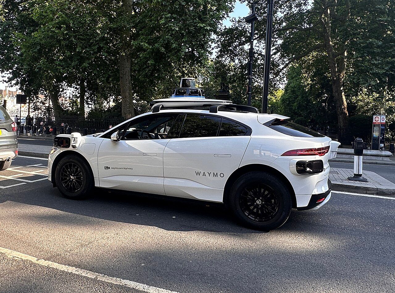
That line from Musk’s 2024 “We, Robot” event came back to me after I saw one of the new Waymo vehicles on London’s roads. It is a strange vehicle; a Jaguar I-PACE body augmented into something more bulbous, with cameras and sensors protruding from every corner and a roof-mounted stack that looks almost like a cartoonish hat.
Compared with Tesla’s Cybercab, the Waymo becomes, as the youth say, “mogged”. Tesla’s design is hardly perfect, though; the branding is closer to a graffiti tag than a refined piece of industrial design. But its autonomous-car proposition at least tries to look like an Art Deco-inspired future imagined by science fiction. The Cybercab and related vehicle proposals have a recognisable visual thesis. They do not merely look like today with more sensors attached to make it work.
My objection, perhaps an overreaction, is not that Waymo’s engineering looks serious, or that I dislike the fact that such a car exists. Quite the opposite. I respect the engineering and support the ambition to make our roads safer by reducing our dependence on fallible human drivers. Waymo says its London trials have trained “Autonomous Specialists” on board, with the intention of offering fully autonomous rides without a human behind the wheel, as it already does in American cities. Uber and Wayve’s supervised London service also has a safety driver, so this is hardly unique to Waymo. The caution is understandable; such vehicles require a high degree of trust. But the image of the future changes when you encounter a supposedly autonomous car and still see a person sitting there, ready to intervene.

The futuristic promise is that the machine has crossed a threshold. You are sitting inside a system that no longer needs someone to do the driving and become stressed by it. It promises to change the way you do things for the better. Fiction often gives that threshold a personality. Delamain, the AI-powered taxi service in Cyberpunk 2077, is memorable because the system itself has character. Its car looks like a 1970s saloon, but the machine feels like an entity with a point of view, able to talk to you and make witty remarks. Many objects acquire a similar character through their forms and behaviour, even without a voice.
A fully driverless ride can still be magical, even if I find the vehicle ugly. The tourist novelty of Waymo rides in cities such as San Francisco makes that clear. My distinction is not simply between the appearance of two manufacturers’ cars. The experience communicates completion. The machine is doing what it was promised to do, in a way that can move our sense of pride and wonder forward with it.

That lunch-break observation led me towards a wider problem. Much of what I increasingly recognise as the “Yookay” contains elements of a technological future, including several of its dystopian possibilities, without the visual language we were trained to expect from Blade Runnerand other great futuristic fictions of the late twentieth century. It produces a peculiar disappointment, of which the Waymo was one small example.
A safe future
Waymo is owned by Alphabet, and its visual world sits naturally within the wider language of contemporary Silly-Con Valley. Clean typography, rounded surfaces, bright colours, gradients and reassuring interfaces are accompanied by an almost total absence of visible menace. I tend to call this “lanyard-safe corporate”, borrowing from “lanyardism” and its associations with institutional progressivism, regulation, inclusion and managerial caution. The tendency is not exclusive to Google, nor is it entirely reducible to politics. It is a culture produced by a particular relationship between institutions, risk and taste.
Google is a useful example because it helped normalise the idea that soft geometry, bright colours and approachable interfaces signify a good technological outcome. Its Material Design shape system formalised choices such as rounded and cut corners. To my eye, much of its visual language has an almost childlike playfulness. It is functional, often very well so. My problem begins when that language becomes the only one a culture can comfortably imagine using.
Every edge becomes a usability problem. A dark surface seems vaguely hostile, while a smiling interface promises a fulfilling existence and leaves you wondering what advertising profile is being built beneath the polish. Every sharp corner needs a reason to exist in place of its rounded alternative, which assures you that it is safe to touch and safe to look at. The product must appear safe before it is allowed to appear as powerful as it may be.
The same mentality extends into institutional language. Net-zero commitments, DEI policies, accessibility standards, safety requirements, brand guidelines, legal review and reputational risk all bear upon what can be made. None is automatically bad. But when enough expectations accumulate around what an acceptable object should be, the safest aesthetic becomes the default because the cost of being wrong exceeds the reward for being distinctive.
The James Damore memo controversy is relevant here because it exposed the entanglement of workplace culture, permitted speech and institutional values. It does not, by itself, establish a causal explanation for Google’s design choices. It does suggest why design inside an organisation cannot be understood through technical specifications alone. Assumptions about what is safe, normal or desirable eventually find expression in what that organisation makes.
We used to have movements
One reason the present feels visually impoverished is that earlier eras did more than consume existing aesthetics and remix them. They put work into inventing and developing styles appropriate to their times.
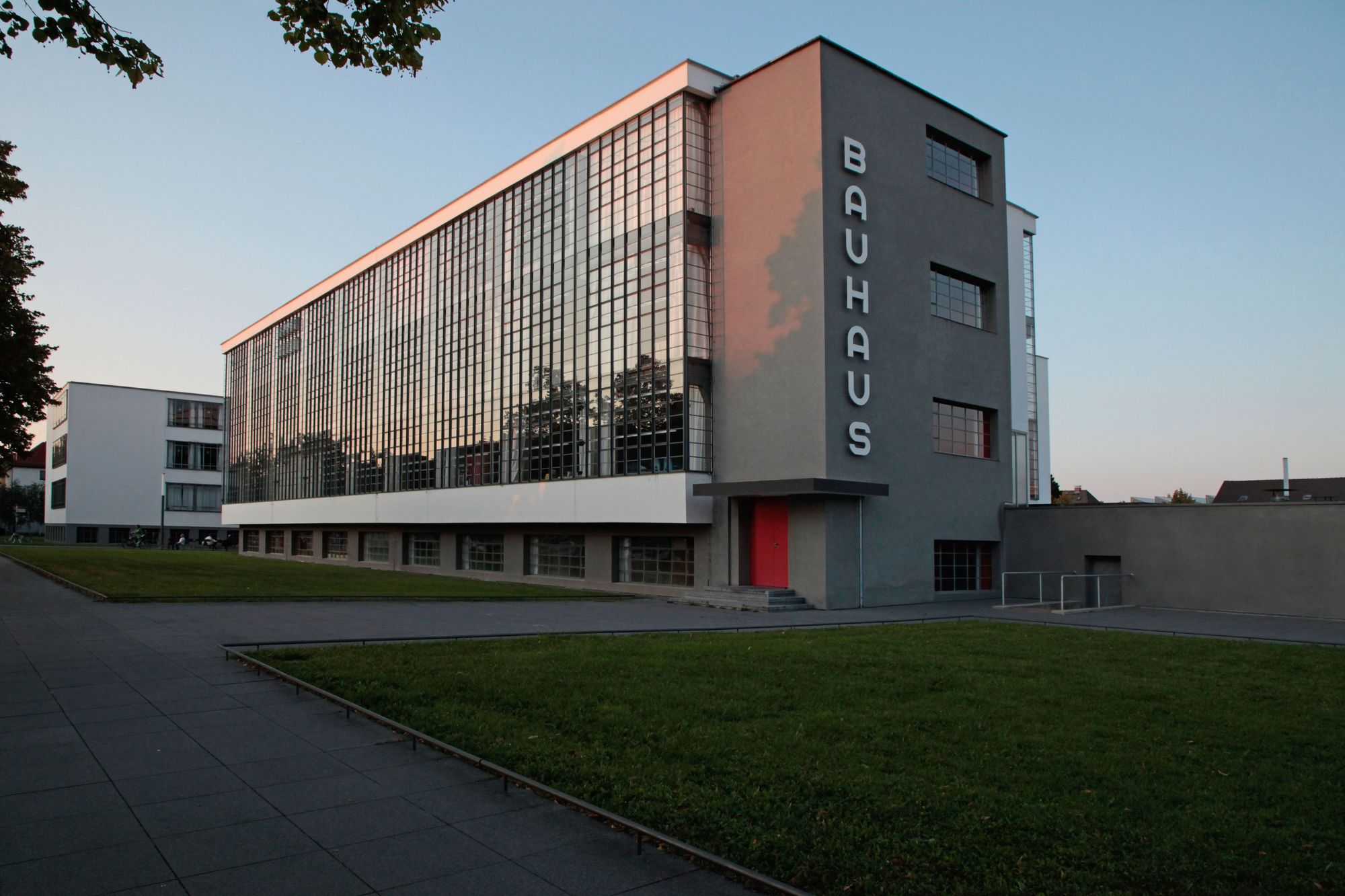
The twentieth century is full of groups attempting to design an entire future. Bauhaus sought a new relationship between art, industry and everyday life. Futurism glorified speed, machinery and rupture with the past. Later, the Atomic Age and Space Age turned nuclear energy, aviation and rocketry into visual languages of optimism. Their influence appeared in architecture, furniture, cars, fashion, posters, packaging, typography and machines. An aesthetic belongs to the culture that forms it, and the things a culture makes tell us something about what it admires.

You can see this in the streamlined forms of the 1930s, in the machines of the 1950s, sculpted by a civilisation transformed by war, rocketry and telecommunications, and in the severe technical confidence of 1980s hardware. An object said something before you used it. It had authority as a tool, and enough character to suggest that its makers knew what they were doing.
Even rebellious subcultures and darker visions developed coherent styles. Cassette futurism, cyberpunk and neon noir imagined futures of grime, surveillance, excess, machinery and moral ambiguity. The metalhead look turned leather, studs and black clothing into a recognisable cultural language. Cyberpunk 2077 and Altered Carbon are contemporary examples of media still mining these aesthetics, although they arguably remix and develop them without inventing a radically new visual movement.
The important question is not whether those styles were correct. Many now seem naïve, ridiculous, frightening or politically ugly. They were nevertheless visions from which something could be made. We are very good at reusing old aesthetics through Pinterest boards, AI image generators and algorithmic feeds. We seem less confident about deciding what a civilisation we want to inhabit should look like, without descending into parody, nostalgia or empty visual pornography.
There are attempts to recover that instinct. Anglofuturism is one of the more interesting, if we bring the discussion back to England. At its simplest, it asks what the Anglosphere might look like if it stopped treating its increasingly remote past and its uncertain technological future as mutually exclusive. It imagines architectural memory, engineering, industry and national character finding expression in advanced transport, robotics, nuclear power, new cities and even settlements beyond Earth.
Given our present circumstances, such imagery can be knowingly ridiculous. A Tudor building beside a space elevator would be odd. A Union Jack above a lunar colony is difficult to imagine when we cannot sort out the trains at home. But beneath the jokes is a proposition that the future need not become culturally anonymous. It can acknowledge an inheritance without being confined to reproducing it.
This problem applies to more than one political camp. The archetypal “rebel” offered by contemporary Hollywood can be aesthetically indistinguishable from the institution against which they are supposedly rebelling. A university-educated, media-literate figure explaining their politics through Marxfest projects, Substack essays, TikToks, podcasts or long-form video essays is not necessarily rebellious. There is a factory line churning out that figure en masse, like anything else.
Even as I describe this rebel, I realise I am describing a fairly ordinary person. “LARPing”, borrowed from live-action role-playing, captures the habit of behaving as though one inhabits an imagined role. In Baudrillardian fashion, so much feels like a simulacrum of what it was meant to represent, separated from the real by layers of abstraction. Across the West, ideological ecosystems produce plenty of political role-playing, but surprisingly little tangible culture beyond the physical consequences of what they do or neglect to do.
Degrowth, for example, seems to me more persuasive as an academic exercise than as a vision of a world I might want to inhabit. I struggle to see a comparably coherent language of architecture, machinery, clothing and consumer objects beyond prototypes that rarely escape the blog post. Its suspicion of increased production may help explain that difficulty, but it leaves unanswered the question of what its adherents would actually build.
Compare that with the organised modernist movements of the last century. They produced buildings, posters, clothing, typefaces, products and machines. Their ideas entered the world as things. Today, supposedly opposed factions share the same phones, cars, fonts, laptops, office furniture and websites. Mass production makes it cheaper and easier to supply objects that are acceptable to almost anyone. The verbal argument is intense, yet its visual expression is remarkably subdued. Perhaps we have decided that the contents matter more than the cover; but a cover can tell us what kind of book we are about to open.
The lowest common denominator
Modern consumer design is increasingly built around the idea that an object should work for almost anyone. From a mass-market perspective, that is often sensible. A product intended to sell widely should not require specialist knowledge to operate. But I think an important distinction has been lost between making something accessible and making it generic.
Accessibility removes unnecessary barriers. Generality can remove character along with them. The smartphone is the clearest example. It is an extraordinary piece of engineering, yet its industrial form has converged into a narrow category of glass slab, rounded rectangle, thin black bezel and restrained branding. Its identity is largely whatever happens to be on its screen. The fascination with glossiness, softness and effects such as Apple’s Liquid Glass shows how readily a shared visual fashion can spread across the objects we use. The user often has little practical say in whether to go along with the next redesign.
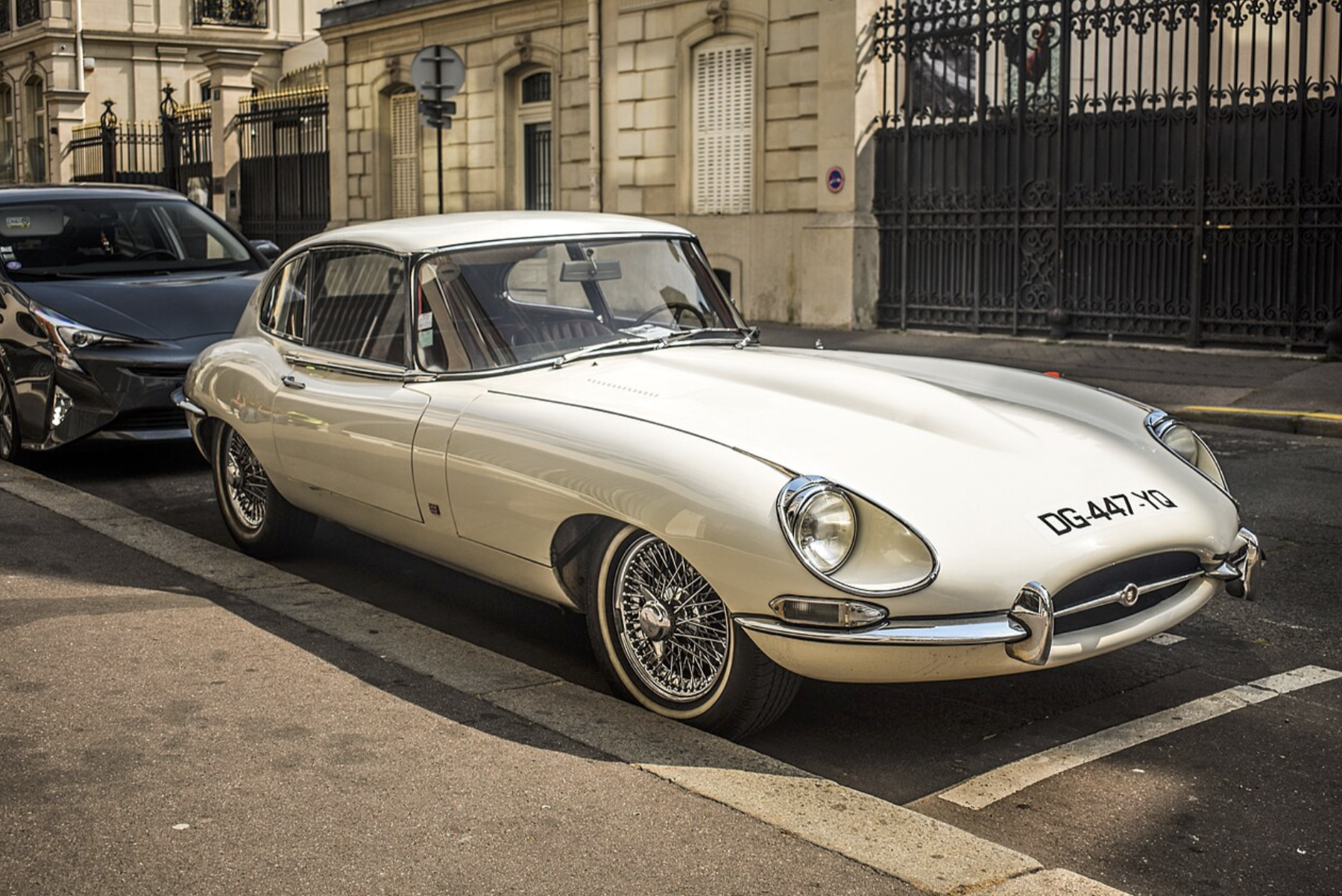
Cars have followed a similar course. Jaguar historically represented a particular kind of British luxury, with long proportions, theatre, chrome, leather, sporting associations and an identifiable animal emblem. Its recent reimagining takes a different approach. Jaguar describes “Copy Nothing” through a philosophy of “Exuberant Modernism”. There is a strange contradiction here. Jaguar wants to look radically different, yet in doing so it abandons much of the visual grammar that made it recognisably Jaguar.
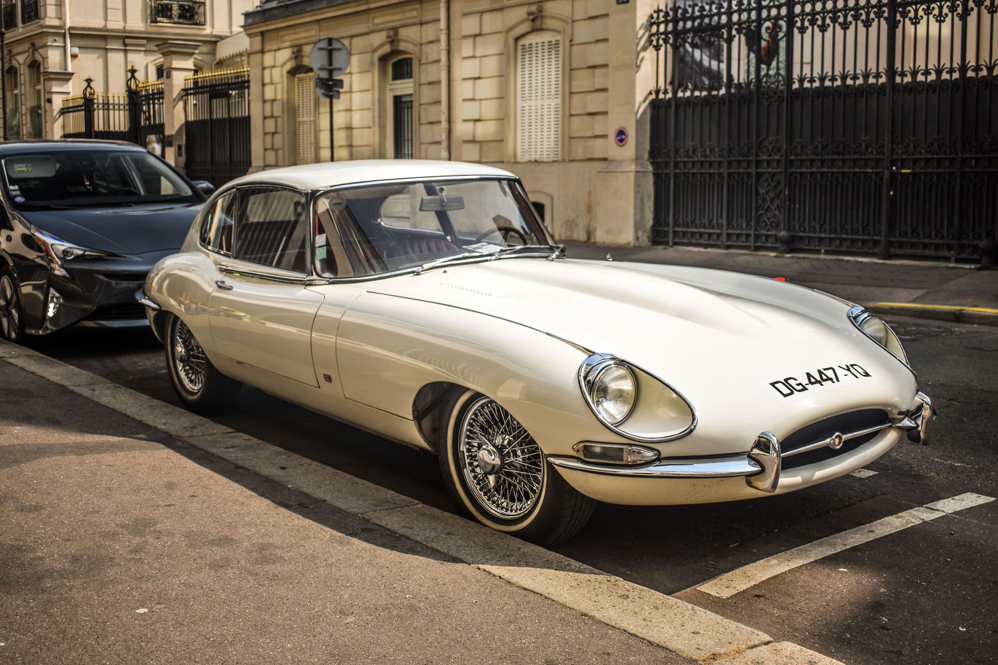

The E-Type was memorable because it was unapologetically specific. Its proportions, posture and attitude belonged to Jaguar, rather than to an interchangeable luxury-car company. When a brand stops expressing a particular place, appetite or sensibility, it can become visually homeless. Lowest-common-denominator design need not make everything ugly; it can leave us with handsome objects that seem to have very little of their own to say.
Form and demoralisation
Marshall McLuhan’s claim that “the medium is the message” points towards the way environments communicate through their form as well as their explicit content. Stafford Beer’s observation that “the purpose of a system is what it does” offers another way of considering their effects. If an environment continually treats you as an anonymous user, you may begin to feel like one, whatever its designers intended. This is why I think sterile design can become demoralising.
Consider hostile architecture. A bench communicates more than an invitation to sit if its geometry is deliberately designed to prevent you from lying down. A public square does something similar when its possible uses have been pre-emptively restricted. The response may make sense as a means of controlling a problem, but that response becomes the aesthetic. Your surroundings fill with instructions about how to behave.
The same logic appears in softer forms. An interface can be so locked down that you feel like a passenger, as many people do on social media. A product can become so generic that it gives you little sense of ownership, making perpetual rental seem less objectionable. If it looks like everything else, exchanging it for the next one seems inconsequential. A building can be so indifferent to its occupants that they feel interchangeable within it, and less inclined to take responsibility for its upkeep.
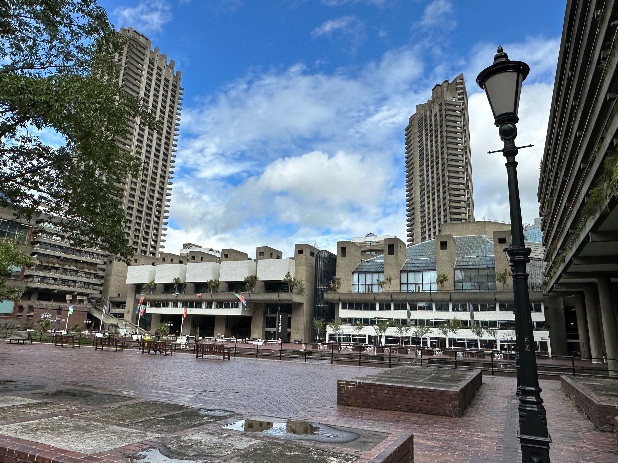
That last sensation has always been my reaction to the Barbican Estate, which many people admire. I do not regard it as a failed piece of architecture. I can see why it was an ambitious post-war project, with a distinct visual and social philosophy. Yet its hard-edged concrete and elevated maze of walkways make me feel like a replaceable component inside a large system. That is my interpretation, not a claim about the architects’ intentions, but the sensation was strong enough to make me glad to return to ordinary streets.
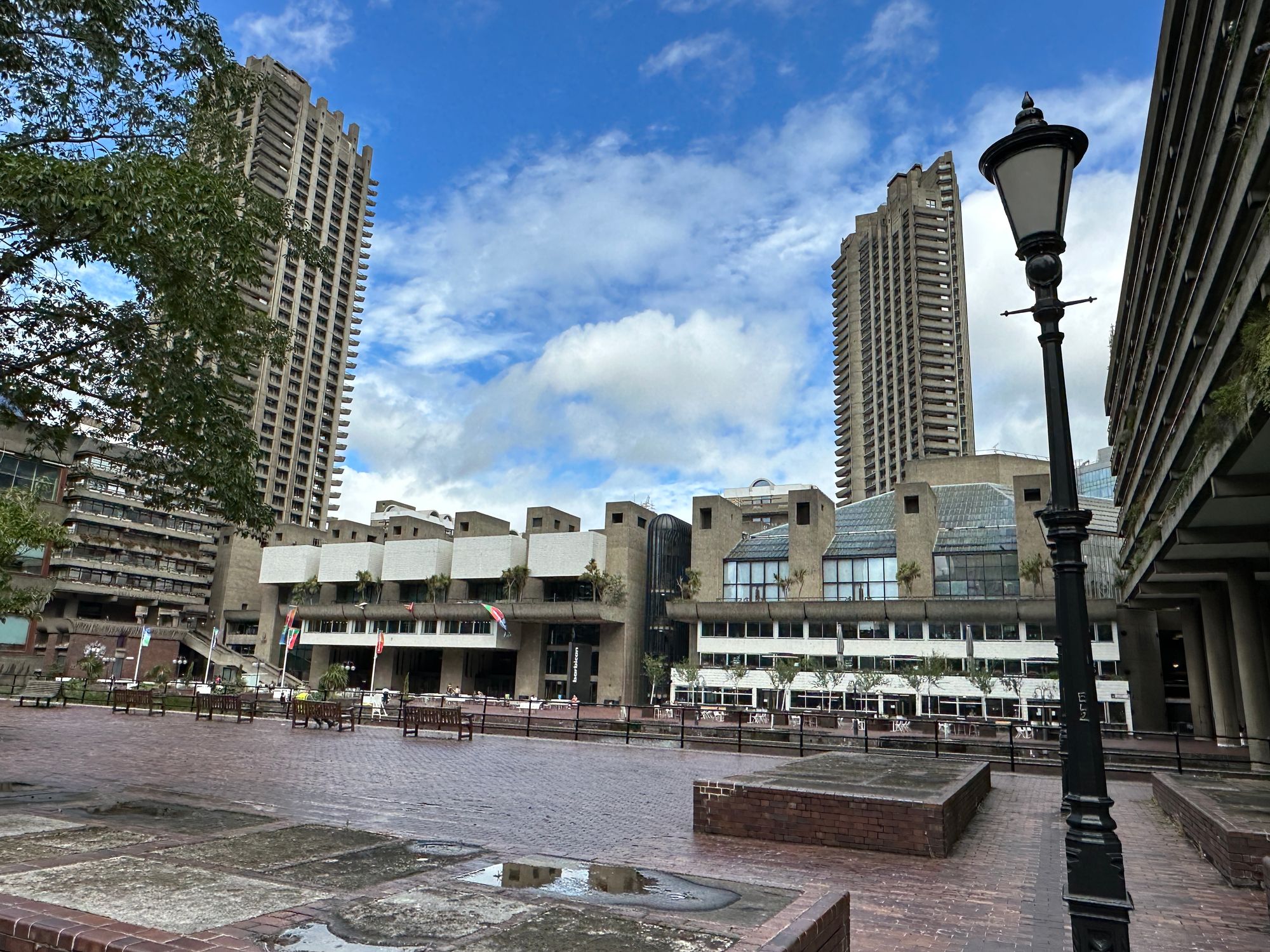

My response changes in a village church built from local stone, a Victorian warehouse whose brick and iron survive conversion into a brewery, or a street in Chongqing saturated with illuminated signs and skyscrapers. These places are not interchangeable, and their differences help explain the distinction I am trying to draw. The Barbican certainly has character; its character happens to make me uneasy. The problem is therefore not simply a contest between old and new, ornament and concrete, or softness and sharp edges. It concerns the kind of life a place seems to offer the person inside it.
Much of our present instead resembles a Black Mirror future. We have pervasive surveillance, algorithms, biometric systems, automated administration, AI assistants, ubiquitous cameras and endless software, presented as harmless consumer services. The rounded corners and friendly faces can make the power beneath them harder to see.
Who designs the future?
None of this requires a conspiracy. Corporations play safe because consumers are often risk-averse, regulators impose constraints and investors dislike unnecessary uncertainty. Designers are generally hired to solve particular problems efficiently, rather than to imagine a civilisation. Creative industries can also be culturally concentrated, making certain assumptions appear universal because the people making decisions share them.
In much of academia and the creative sector, I see progressive assumptions treated as the limits of respectable opinion. Research into the social and political composition of the arts gives some reason to question how representative those institutions are. Where dissent brings a risk of professional or reputational punishment, people may conform, remain quiet or decline to participate. That is a plausible source of cultural narrowing, although it does not explain every dull object we encounter.
The political dimension deserves attention, but it should not substitute for criticism of the work itself. The interesting question is not which tribe caused a particular rounded corner. It is what kind of person the resulting object assumes, what capacities it encourages, and what those assumptions might produce when repeated across a society.
Arguments about culture and identity have repeatedly spilled into technical and fandom spaces, from Gamergate to disputes about whom Star Wars and its sequel trilogy were for. They reveal how difficult it is to separate cultural production from the individual, political and institutional commitments behind it. A design can assume that its user is capable, curious, expressive and slightly rebellious. It can also treat that user primarily as a liability to be managed. If our tools continually assume an interchangeable person, we should not be surprised when their users feel that individuality has little place in the world being offered to them.
Competing futures are useful for this reason, even when they provoke conflict. Anglofuturism asks what Britain might become without culturally erasing itself. Cyberpunk imagines technological power alongside corporate control and social decay. The Silicon Valley AI future places automation and machine intelligence at its centre, sometimes with little apparent regard for what surrounds them. New Space proposes an expansion of civilisation through rockets and off-world industry, while solarpunk imagines ecological technology and distributed communities.
We have plenty of ideas, but many remain trapped in games, essays, moodboards and prototypes. What seems to be missing is the confidence, and often the institutional backing, to turn a particular vision into a programme of building.
A future for Britain
Aesthetics have always changed. The peculiarity of the present is that we seem to expect the future to acquire a distinctive appearance automatically as its technology advances. People still have to design it. Their beliefs and decisions become the surroundings in which everyone else must live.
The future once looked like rockets, concrete, chrome, cassette decks, computer terminals, neon streets, glass domes, swimming pools and impossible machines. Those visions could be naïve or authoritarian, and some are ridiculous when viewed from the present. Nevertheless, their designers were trying to describe somewhere other than the world they already inhabited.
Anglofuturism interests me for precisely that reason. I do not find every one of its ideas convincing, nor do I want Britain to become a giant steampunk theme park. I am drawn to its assumption that a future can have a place, a character and an inheritance. Britain could still look like Britain while becoming technologically ambitious. There is no necessary conflict between making things accessible and giving them character, or between technological progress and cultural memory.
Nor do I want endless demands to “bring back” one vanished thing after another. I do not want to live permanently inside a museum of our glorious past. I want something new that takes what is worth keeping, rejects what is no longer wanted and develops it into something we have not yet seen. Otherwise, those with the means to design our surroundings will continue to make those decisions for us, according to ambitions we may not share.
We have more technical means at our disposal than the people who imagined most of our favourite futures. What seems less certain is our willingness to decide what to do with them. Autonomous cars, artificial intelligence, robotics, reusable rockets and biotechnology ought to give us ample scope to build things with an identity of their own, without disguising their power beneath a reassuring consumer aesthetic.
I want powerful things to be allowed to look powerful, beautiful things to be beautiful, and British things to retain some recognisable connection to Britain. That leaves room for strangeness, experiment and disagreement. It also asks more of us than another remix of a familiar moodboard. If the future is going to arrive anyway, I would like us to put some thought and effort into making it a place we actually want to inhabit.